-
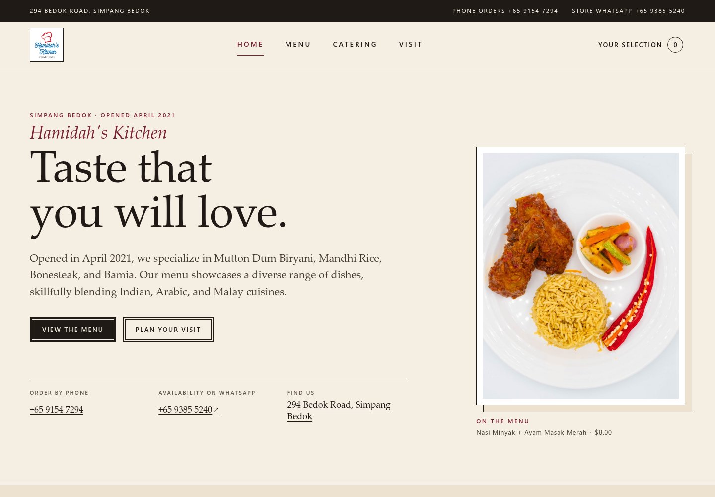
Direction 1
Neighbourhood Table
Calm and editorial: warm cream, elegant serif type and a framed dish photo, with phone, WhatsApp and address set out clearly below.
Trade-off: feels refined and welcoming, but quieter — the signature dishes are less prominent at first glance.
Open preview -
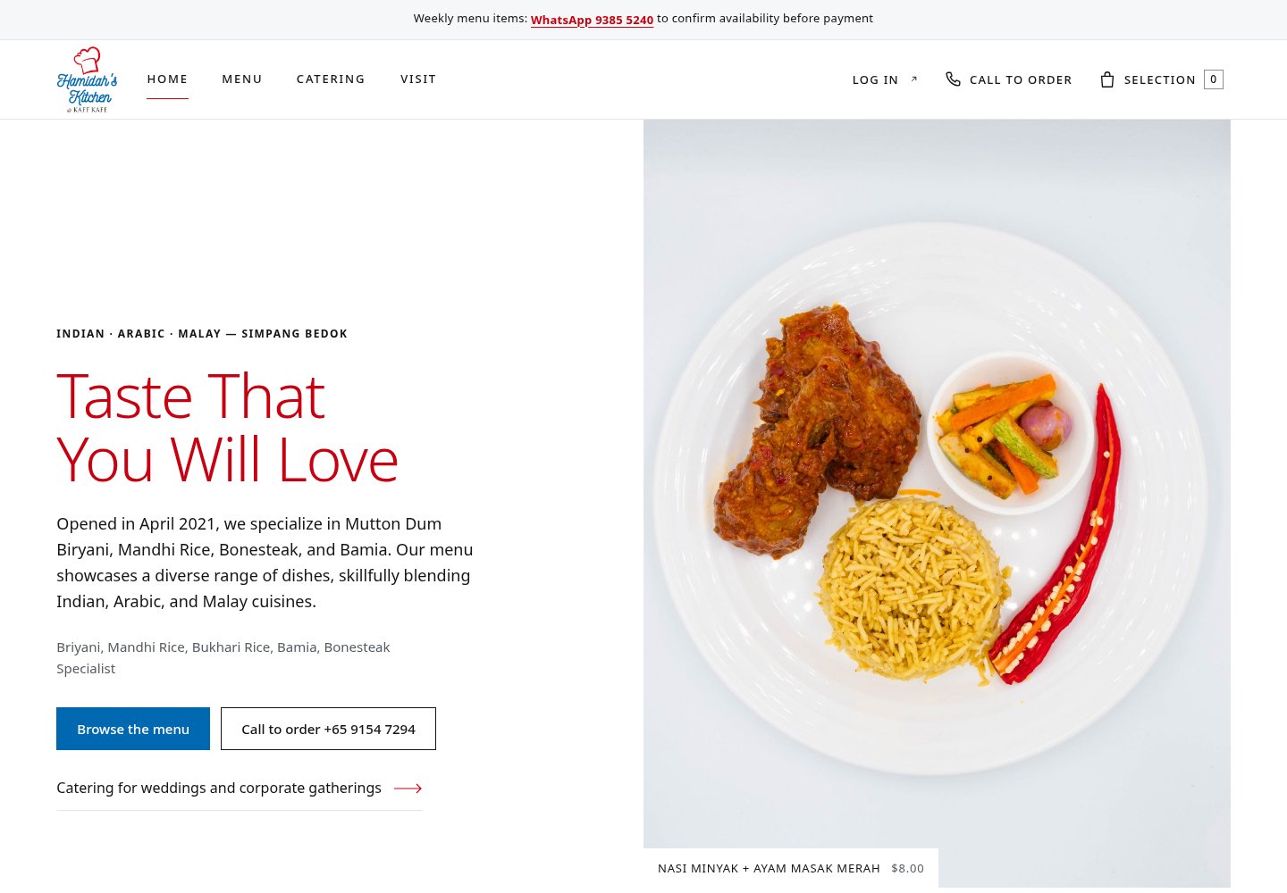
Direction 2
Food First
Bright and direct: a large dish photo leads, with “Browse the menu” and “Call to order” front and centre and a weekly-menu note at the top.
Trade-off: the most straightforward for ordering, but the clean layout has less of the shop’s own personality.
Open preview -
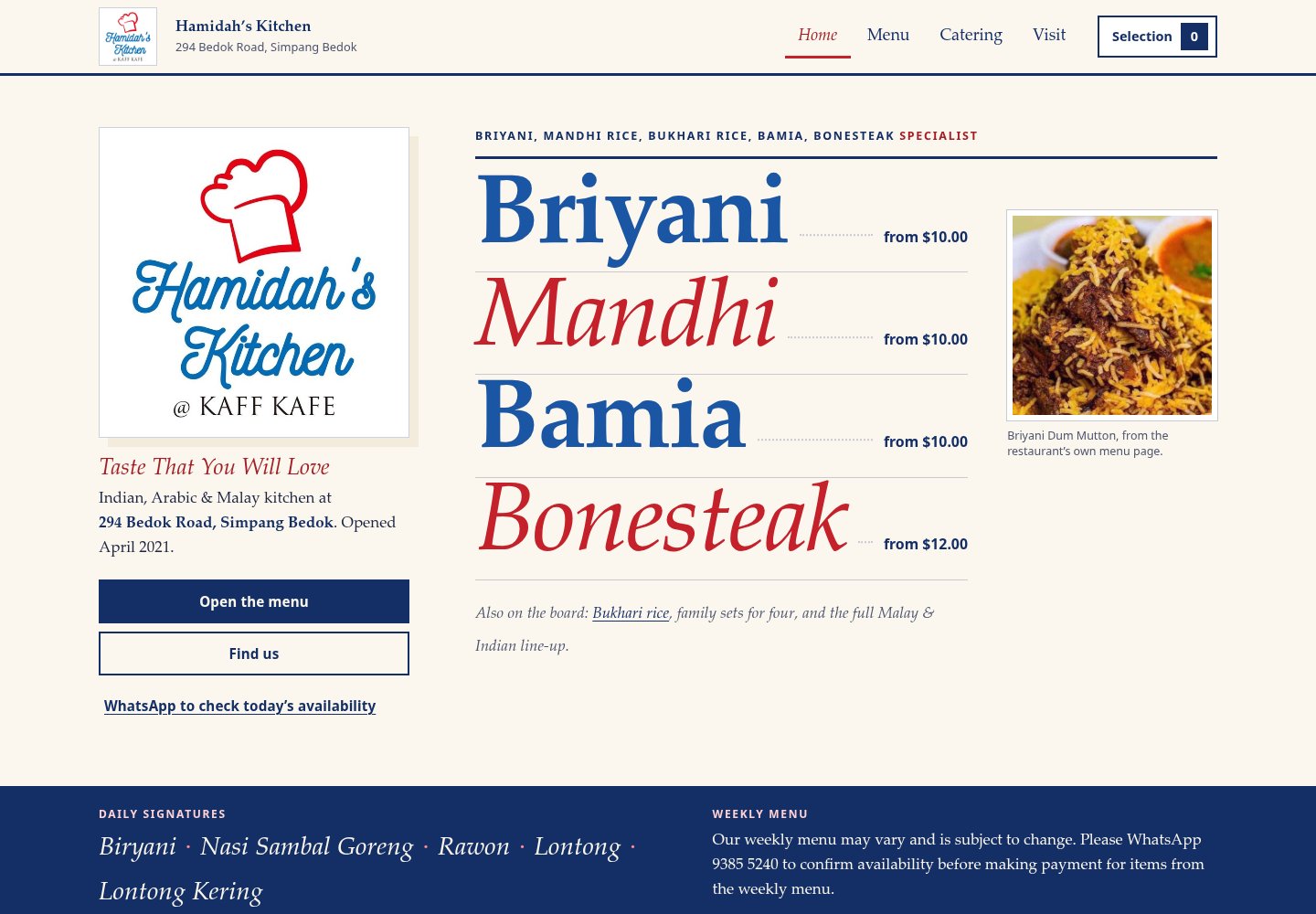
Direction 3
Simpang Kitchen
Bold menu-board style: the logo is large and the signature dishes appear in big type with starting prices right on the home page.
Trade-off: the most distinctive and shows dishes and prices immediately, but is busier and relies less on food photography.
Open preview
What works in the previews
- Browsing the menu and moving between pages.
- Adding dishes to a draft selection, kept only in your own browser.
- Shop and account links open the existing Hamidah’s Kitchen website. Your draft selection is not carried over.
Please keep in mind
- Real checkout and payment have not been rebuilt here.
- These pages are private and only reachable on our shared private network.
- They are review previews — not a finished launch, and not a full accessibility review.